
Predictive Marketing with AI: How Brands Can Anticipate Customer Behavior in 2025
October 8, 2025
5G and Beyond: How Faster Mobile Networks Are Changing Digital Marketing
October 13, 2025
Why mobile design is all about comfort, reachability and intuitive interaction.
As mobile usage continues to dominate digital engagement, the way people physically interact with their screens has changed how designers approach UI and UX. In 2025, mobile experiences are no longer designed for screens, they’re designed for thumbs.
With over 92% of global internet users accessing the web via smartphones (DataReportal, 2025), thumb-friendly design has become a core UX priority for web designers, app developers and digital marketers alike.
Let’s explore how modern design principles have evolved, and how you can make your website or app feel effortless to use on mobile.
-
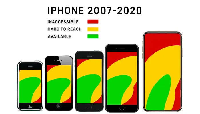
The Thumb Zone: Designing for Natural Reach
The “thumb zone”, first identified by UX expert Steven Hoober, represents the area of the screen users can comfortably reach with one thumb.
As smartphone screens have grown, this zone has shifted downward and toward the centre of the screen.
2025 Best Practice:
- Place key interactive elements like CTAs, menus and navigation within the natural thumb zone.
- Avoid top-corner actions for right-handed users.
- Use bottom navigation bars instead of hamburger menus for faster reach.
Apps like Instagram and YouTube exemplify thumb-first design, all major actions (like, comment, share) are comfortably placed near the bottom for one-handed use.
-
Bigger Buttons, Better Interactions
Tap targets that are too small cause frustration and reduce conversions. According to Google’s Material Design Guidelines, touch targets should be at least 48×48 pixels, large enough for any fingertip.
Pro Tip:
- Leave at least 8px spacing between tap targets.
- Prioritize thumb-friendly CTAs like “Buy Now,” “Book a Demo,” or “Get Started.”
- Use clear visual feedback (colour change or animation) on tap to confirm interaction.
In 2025, accessibility and UX are intertwined, if users can’t comfortably click, they won’t convert.
-
Gesture-Based Navigation Takes Over
Buttons are giving way to gestures, swipes, drags and pinches. With iOS and Android’s full-screen gesture navigation, designers must create interfaces that feel natural and predictable.
Design for Familiarity:
- Use intuitive gestures users already understand (swipe left to delete, pinch to zoom).
- Avoid gesture overload, too many hidden interactions can hurt usability.
- Add subtle visual hints (arrows, motion cues) to guide users.
Apps like Spotify and Notion have mastered gesture-based UX, making actions faster and interfaces cleaner.
-
Micro interactions and Haptic Feedback
Micro interactions, small animations that respond to user input, are a defining trend of 2025.
Combined with haptic feedback, they make interfaces more tactile and satisfying.
Examples:
- A heart animation when a post is liked.
- Gentle vibration when dragging an item.
- Smooth transition when toggling between tabs.
These subtle details enhance engagement and create a sense of emotional connection between the user and the app.
-
Mobile Typography and Readability
Thumb-first design also influences text hierarchy and legibility. Designers now prioritize:
- Larger font sizes (16px minimum) for body text.
- High colour contrast for outdoor readability.
- Concise copy, fewer words, stronger impact.
According to Adobe’s 2025 UX study, users spend 22% more time engaging with mobile content that is scannable and visually clear.
-
One-Handed Design and Adaptive Layouts
Foldable and ultra-wide phones have changed the mobile design landscape. Adaptive layouts, powered by responsive CSS frameworks and AI-driven design systems, automatically adjust content for different screen ratios.
Tools like Figma Auto Layout and Framer AI now generate adaptive, thumb-optimized designs automatically, saving designers hours of manual testing.
Conclusion
Mobile UX in 2025 is about designing for comfort, not just beauty.
By embracing thumb zones, larger tap targets, gesture navigation and haptic micro interactions, designers can create experiences that feel natural, fluid and satisfying.
The goal is simple: every action should be within reach, literally.
In an era where the thumb rules, design that feels effortless wins the user’s heart.
If you have any questions regarding “Marketing with AI” feel free to contact us. For inquiries and consultations, call us at: +92 321 4808303 or Email us at: hello@owaisgilani.com.
Disclaimer: The information shared on this website is for educational and informational purposes only and reflects my personal views and experiences. While I strive to provide accurate and helpful content, readers should use their own judgment and consult with a qualified professional before making any decisions based on the information here. I am not responsible for any actions taken based on this content. Feel free to reach out to me if you need clarification or have questions before using any part of this information.